Showing posts with label water. Show all posts

Dangerous situation in Arctic

In the North Pacific, the flow of warmer water is clearly visible (see images right, green circle left).

In the North Atlantic, huge amounts of heat are moving into the Arctic Ocean (green circle right).

At some spots, heat that is traveling underneath the sea surface comes to the surface (green circle at the top).

Most warming caused by people's emissions goes into oceans, especially into the top layer of oceans.

Furthermore, warmer air and warmer sea surfaces can cause winds to grow dramatically stronger. As the Arctic is warming much faster than the rest of the world, the narrowing difference between the temperatures at the North Pole and the Equator is decreasing the speed at which winds circumnavigate Earth; at the same time, the amount of heat that is moving north can grow dramatically, both due to winds and sea currents, and cyclones can further accelerate this.

The danger is that an influx of warm salty water will reach the seafloor and trigger methane eruptions.

The situation is especially critical in many parts of the Arctic Ocean where the water is very shallow. Some 75% of the East Siberian Arctic Shelf (ESAS) is shallower than 50 m (see maps on the right).
[ warm water from the Atlantic Ocean is
increasingly invading the Arctic Ocean ]


The danger here is huge, for numerous reasons, incl.:

• shallow waters can warm up very rapidly in case of an influx of warm water;

• these shallow seas are now covered by ice, so the heat cannot escape to the atmosphere;

• sea ice is very thin, so the sea ice won't act as a buffer to absorb the heat;

• methane rising through shallow waters will pass through the water column and enter the atmosphere more quickly;

• in shallow waters, large abrupt releases will more quickly deplete the oxygen in the water, making it harder for microbes to break down the methane;

• hydroxyl levels over the Arctic are very low, which means that it takes much longer for methane over the Arctic to get broken down.

The four videos below provide a good introduction into the various issues and illustrate how dangerous the situation is in the Arctic.

Each video is part of a talk between Dave Borlace and Peter Wadhams.

Part 1 discusses albedo change in the Arctic and associated changes such as jet stream changes.


Part 2 discusses the threat of huge methane releases in the Arctic.


Part 3 discusses the thermohaline circulation and methods that could improve the situation such as carbon removal and Ocean Mechanical thermal Energy Conversion (OMTEC).


Part 4 discusses sea level rise and fires.


The situation is dire and calls for comprehensive and effective action, as described at the Climate Plan, i.e. multiple lines of action implemented in parallel and locally where possible.


Links

• As El Niño sets in, will global biodiversity collapse in 2019?
https://arctic-news.blogspot.com/2018/11/as-el-nino-sets-in-will-global-biodiversity-collapse-in-2019.html

• Doomsday by 2021?
https://arctic-news.blogspot.com/2018/11/doomsday-by-2021.html

• Climate Plan
https://arctic-news.blogspot.com/p/climateplan.html

• Feedbacks
https://arctic-news.blogspot.com/p/feedbacks.html

• Extinction
https://arctic-news.blogspot.com/p/extinction.html

• Seismic Events
https://arctic-news.blogspot.com/p/seismic-events.html

• Can we weather the Danger Zone?
https://arctic-news.blogspot.com/2018/07/can-we-weather-the-danger-zone.html

• How much warmer is it now?
https://arctic-news.blogspot.com/2018/04/how-much-warmer-is-it-now.html

• What Does Runaway Warming Look Like?
https://arctic-news.blogspot.com/2018/10/what-does-runaway-warming-look-like.html

• Peaks Matter
https://arctic-news.blogspot.com/2018/08/peaks-matter.html

• Warning of mass extinction of species, including humans, within one decade
https://arctic-news.blogspot.com/2017/02/warning-of-mass-extinction-of-species-including-humans-within-one-decade.html


Will August 2018 be the hottest month on record?


July and August are typically about 3.6ºC or 6.5ºF warmer than December and January. August is typically 1.8°C or 3.24ºF warmer than the average annual temperature. Above image shows how much higher the temperature was for selected months, compared to the annual global mean for the period 1980-2015. Will August 2018 be the hottest month on record?

Numerous temperature records have fallen across the world recently. Heat stress hazard is high under conditions of high surface air temperature and high relative humidity. When looking at heat stress hazards, it's therefore important to look at surface air temperatures over land, i.e. the temperature of the air above the land surface.

Fire hazard is high under conditions of hot and dry soil and strong wind. When looking at fire hazards, it's therefore important to look at land surface temperatures, reflecting how hot the surface of the Earth would feel to touch in a particular location. The map below shows land surface temperatures.


When calculating how much warmer it is now, a number of things must be taken into account:
  1. Baseline

    What baseline is used and how is the temperature at the baseline calculated? In the image at the top, the baseline is 1980-2015, which is a very recent period. When using a preindustrial baseline, anomalies could be more than 0.6°C higher than when using the 1951-1980 baseline that NASA normally uses.

  2. Surface temperatures or surface air temperatures?

    Above map shows land surface temperatures. As said above, this is different from surface air temperatures over land that show the temperature of the air above the land surface.

    Similarly, sea surface temperatures indicate the temperature of the water at the surface. Sea surface air temperatures, on the other hand, are slightly higher, they are measurements of the air temperature just above the surface of the water.

    NASA typically uses surface air temperatures over land, while using surface water temperatures over oceans. When instead using air temperatures globally, the temperature anomaly could be more than 0.1°C higher.
     
  3. Missing data

    How are missing data dealt with? To calculate the global mean on maps, NASA uses four zonal regions (90-24ºS, 24-0ºS, 0-24ºN, and 24-90ºN) and fills gaps in a region by the mean over the available data in that region. In datasets, however, missing data are typically ignored. This could make a difference of 0.2°C. Ignoring data for the Arctic alone could make a difference of 0.1°C.  
Depending on how the above three points are dealt with, the temperature in August 2018 may well be more than 3°C above the mean annual global temperature in 1750. The question is whether August 2018 will be warmer than August 2016, which was 2.3°C warmer than 1980-2015.

Anthropogenic Global Warming

Remember the Paris Agreement, when politicians pledged to take efforts to ensure that the temperature would not cross 1.5°C above preindustrial? Why did the Paris Agreement not specify a year for preindustrial? Perhaps the idea was that total anthropogenic global warming should not exceed 1.5°C. In other words, the warming that people had already caused by 1750, plus the warming people caused since 1750, plus the warming that is already baked in for the decades to come. The image below illustrates this idea and also shows that we're well above 1.5°C anthropogenic global warming.

[ click on images to enlarge ]
In the image below, temperatures have also been adjusted to better reflect a preindustrial baseline (1750), showing that temperatures were not higher than 1°C above preindustrial during the entire Holocene, until recently.


In a recent paper, James Hansen et al. conclude that temperatures also weren't more than 1°C above preindustrial during the previous interglacial, the Eemian, which implies that temperatures haven't been more than 1°C above preindustrial for the entire 200,000 years that modern people, i.e. the species homo sapiens, have existed, and that temperatures have only recently rising to levels more than 1°C above preindustrial. Quite likely, to find temperatures as high as today's, one would have to go back some 3 million years.

Fires over North America, August 2018

Fires can significantly influence temperatures in a number of ways. The images below show how fires boosted carbon dioxide, carbon monoxide and sulfur dioxide levels on August 19, 2018. Carbon dioxide and carbon monoxide both raise temperatures. On the other hand, sulfur dioxide lowers temperature by reflecting sunlight back into space.

  Top left: carbon monoxide as high as 51495 ppb 
  Top right: carbon dioxide as high as 836 ppm
  Bottom left: Smoke over North America
  Bottom right: sulfur dioxide as high as 1917.57 µg/m³
The image below illustrates to what extent smoke from fires boosted black carbon in the air over North America on August 23, 2018. Black carbon causes both cooling and warming. Black carbon shades the surface, somewhat cooling the surface of land and water, while it also absorbs heat, thus warming the air above the surface. Furthermore, black carbon causes warming by darkening the surface once it settles down. Studies have calculated that black carbon has a total net global warming effect of more than 1.1 W/m².


Dust and further aerosols

The impact of aerosols such as sulfur dioxide and dust is often overlooked. The image below shows that τ, i.e. light at 550 nm as a measurement of aerosol optical thickness due to dust aerosols, was as high as 4.0641 on June 16, 2018.


[ goats, from Wikipedia ]
Dust is one reason why temperatures didn't cross the 1°C above preindustrial mark during the peak of the recent Milankovitch cycle. A recent study calculates that the global annual mean surface temperature increases by 0.3°C for the mid-Holocene (6 ka), if the dust is completely removed.

Most dust appears to originate from the Sahara Desert, which lost its vegetation during the Holocene due to goats, according to this study, as people removed predators such as lions and tigers. As the Sahara lost its vegetation, the surface became more reflective, while dust further made that temperatures didn't rise as much as they otherwise would have.

Deforestation has caused a lot of carbon dioxide to be added during preindustrial times, and there is also the impact of black carbon aerosols, resulting from biomass and fossil fuel burning, which causes some 1.1W/m² warming today and some 0.2W/m² is coming from preindustrial activities.

In conclusion, temperatures would be a lot lower in the absence of human activities, while total anthropogenic global warming over the past few thousand years is much larger than most people think.

The situation is dire and calls for comprehensive and effective action, as described in the Climate Plan.


Links

• NASA - The Northwest is Running Hot and Dry
https://earthobservatory.nasa.gov/images/92601/the-northwest-is-running-hot-and-dry

• NASA GISS (Goddard Institute for Space Studies) Surface Temperature Analysis (GISTEMP)
https://data.giss.nasa.gov/gistemp

• NASA - Just Another Day on Aerosol Earth
https://earthobservatory.nasa.gov/images/92654/just-another-day-on-aerosol-earth

• Aerosols
https://arctic-news.blogspot.com/p/aerosols.html

• How much warming have humans caused?
https://arctic-news.blogspot.com/2016/05/how-much-warming-have-humans-caused.html

• How much warmer is it now?
https://arctic-news.blogspot.com/2018/04/how-much-warmer-is-it-now.html

• Extinction
https://arctic-news.blogspot.com/p/extinction.html

• Climate Plan
https://arctic-news.blogspot.com/p/climateplan.html


A Global Temperature Rise Of More than Ten Degrees Celsius By 2026?

How much have temperatures risen and how much additional warming could eventuate over the next decade? The image on the right shows a potential global temperature rise by 2026 from pre-industrial levels. This rise contains a number of elements, as discussed below from the top down.

February 2016 rise from 1900 (1.62°C)

The magenta element at the top reflects the temperature rise since 1900. In February 2016, it was 1.62°C warmer compared to the year 1900, so that's a rise that has already manifested itself.

Rise from pre-industrial levels to 1900 (0.3°C)

Additional warming was caused by humans before 1900. Accordingly, the next (light blue) element from the top down uses 0.3°C warming to reflect anthropogenic warming from pre-industrial levels to the year 1900.

When also taking this warming into account, then it was 1.92°C (3.46°F) warmer in February 2016 than in pre-industrial times, as is also illustrated on the image below.


Warming from the other elements (described below) comes on top of the warming that was already achieved in February 2016.

Rise due to carbon dioxide from 2016 to 2026 (0.5°C)

The purple element reflects warming due to the amount of carbon dioxide in the atmosphere by 2026. While the IEA reported that energy-related carbon dioxide emissions had not risen over the past few years, carbon dioxide levels in the atmosphere have continued to rise, due to feedbacks that are kicking in, such as wildfires and reduced carbon sinks. Furthermore, maximum warming occurs about one decade after a carbon dioxide emission, so the full warming wrath of the carbon dioxide emissions over the past ten years is still to come. In conclusion, an extra 0.5°C warming by 2026 seems possible as long as carbon dioxide levels in the atmosphere and oceans remain high and as temperatures keep rising.

Removal of aerosols masking effect (2.5°C)

With dramatic cuts in emissions, there will also be a dramatic fall in aerosols that currently mask the full warming of greenhouse gases. From 1850 to 2010, anthropogenic aerosols brought about a decrease of ∼2.53 K, says a recent paper. While on the one hand not all of the aerosols masking effect may be removed over the next ten years, there now are a lot more aerosols than in 2010. A 2.5°C warming due to removal of part of the aerosols masking effect therefore seems well possible by the year 2026.

Albedo changes in the Arctic (1.6°C) 

Warming due to Arctic snow and ice loss may well exceed 2 W per square meter, i.e. it could more than double the net warming now caused by all emissions by people of the world, calculated Professor Peter Wadhams in 2012. A 1.6°C warming due to albedo changes (i.e. decline of both Arctic sea ice and snow and ice cover on land) therefore seems well possible by the year 2026.

Methane eruptions from the seafloor (1.1°C)

". . we consider release of up to 50 Gt of predicted amount of hydrate storage as highly possible for abrupt release at any time," Dr. Natalia Shakhova et al. wrote in a paper presented at EGU General Assembly 2008. Authors found that such a release would cause 1.3°C warming by 2100. Note that such warming from an extra 50 Gt of methane seems conservative when considering that there now is only some 5 Gt of methane in the atmosphere, and over a period of ten years this 5 Gt is already responsible for more warming than all the carbon dioxide emitted by people since the start of the industrial revolution. Professor Peter Wadhams co-authored a study that calculated that methane release from the seafloor of the Arctic Ocean could yield 0.6°C warming of the planet in 5 years (see video at earlier post). In conclusion, as temperatures keep rising, a 1.1°C warming due to methane releases from clathrates at the seafloor of the world's oceans seems well possible by the year 2026.

Extra water vapor feedback (2.1°C)

Rising temperatures will result in more water vapor in the atmosphere (7% more water vapor for every 1°C warming), further amplifying warming, since water vapor is a potent greenhouse gas. Extra water vapor will result from warming due to the above-mentioned albedo changes in the Arctic and methane releases from the seafloor that could strike within years and could result in huge warming in addition to the warming that is already there now. As the IPCC says: "Water vapour feedback acting alone approximately doubles the warming from what it would be for fixed water vapour. Furthermore, water vapour feedback acts to amplify other feedbacks in models, such as cloud feedback and ice albedo feedback. If cloud feedback is strongly positive, the water vapour feedback can lead to 3.5 times as much warming as would be the case if water vapour concentration were held fixed", according to the IPCC. Given a possible additional warming of 2.7°C due to just two elements, i.e. Arctic albedo changes and seafloor methane, an additional warming over the next decade of 2.1°C due to extra water vapor in the atmosphere therefore does seem well possible by the year 2026.

Further feedbacks (0.3°C)

Further feedbacks will result from interactions between the above elements. Additional water vapor in the atmosphere and extra energy trapped in the atmosphere will result in more intense storms and precipitation, flooding and lightning. Flooding can cause rapid decomposition of vegetation, resulting in strong methane releases. Furthermore, plumes above the anvils of severe storms can bring water vapor up into the stratosphere, contributing to the formation of cirrus clouds that trap a lot of heat that would otherwise be radiated away, from Earth into space. The number of lightning strikes can be expected to increase by about 12% for every 1°C of rise in global average air temperature. At 3-8 miles height, during the summer months, lightning activity increases NOx by as much as 90% and ozone by more than 30%. The combination of higher temperatures and more lightning will also cause more wildfires, resulting in emissions such as of methane and carbon monoxide. Ozone acts as a direct greenhouse gas, while ozone and carbon monoxide can both act to extend the lifetime of methane. Such feedbacks may well result in an additional 0.3°C warming by the year 2026.

Total potential global temperature rise by 2026 (10°C or 18°F)

Adding up all the warming associated with the above elements results in a total potential global temperature rise (land and ocean) of more than than 10°C or 18°F within a decade, i.e. by 2026. As said before, this scenario assumes that no geoengineering will take place over the next decade.

The situation is dire and calls for comprehensive and effective action as described in the Climate Plan.


Disappearance Of Thick Arctic Sea Ice

[ view full image at facebook ]


Arctic sea ice is in a horrible state. On August 16, 2015, Arctic sea ice extent was 5.786 million square km, the smallest extent on record for this time of year except for the years 2007, 2011 and 2012, as illustrated by the image on the right.

The situation today is even worse than one might conclude when looking at sea ice extent alone. Thick sea ice is virtually absent compared to the situation in the year 2012 around this time of year, as illustrated by the image below comparing sea ice thickness on August 16, 2012 (left) with August 16, 2015 (right).


The ice used to be over 4 m thick, or over 13 ft thick, north of Greenland and the Canadian Archipelago. This thick multi-year ice has been a feature of the Arctic sea ice for over 100,000 years. It used to be there all year long, unlike the thinner ice that could melt away entirely during the melting season.

The disappearance of this thick multi-year ice is a major development. Why? Until now, the thicker multi-year sea ice used to survive the melting season, giving the sea ice strength for the next year, by acting as a buffer to absorb heat that would otherwise melt away the thinner ice. Without multi-year sea ice, the Arctic will be in a bad shape in coming years, and huge amounts of heat that would otherwise go into melting the ice will instead be warming up the Arctic Ocean, further accelerating warming of its waters.

Absence of thick sea ice makes it more prone to collapse, and this raises the question whether the sea ice could collapse soon, even this year. Sea ice works like a mirror. Without sea ice, sunlight that was previously reflected back into space, will instead be absorbed by the Arctic. Albedo changes in the Arctic alone could more than double the net radiative forcing resulting from the emissions caused by all people of the world, as calculated by Prof. Peter Wadhams back in 2012.

Furthermore, there is a danger that loss of the sea ice will weaken the currents that currently cool the bottom of the sea, where huge amounts of methane may be present in the form of free gas or hydrates in sediments. This danger is illustrated by the image below by Reg Morrison, from an earlier post.


Absence of sea ice also goes hand in hand with opportunities for storms to develop over the Arctic Ocean. Such storms could push the remaining sea ice out of the Arctic Ocean. Such storms could also mix surface heat all the way down to the seafloor, where methane could be contained in sediments.

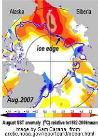
As described in an earlier post, sea surface anomalies of over 5 degrees Celsius were recorded in August 2007 (NOAA image right). Strong polynya activity caused more summertime open water in the Laptev Sea, in turn causing more vertical mixing of the water column during storms in late 2007, as described in this study, and bottom water temperatures on the mid-shelf increased by more than 3 degrees Celsius compared to the long-term mean.

Indeed, the danger is that heat will warm up sediments under the sea, containing methane in hydrates and as free gas, causing large amounts of this methane to escape rather abruptly into the atmosphere.

The image on the right, from a study by Hovland et al., shows that hydrates can exist at the end of conduits in the sediment, formed when methane did escape from such hydrates in the past.

Heat can travel down such conduits relatively fast, warming up the hydrates and destabilizing them in the process, which can result in huge abrupt releases of methane.

Since waters can be very shallow in the Arctic, much of the methane can then rise up through these waters without getting oxidized. As the methane causes further warming in the atmosphere, this will contribute to the danger of even further methane escaping, further accelerating local warming, in a vicious cycle that can lead to catastrophic conditions well beyond the Arctic. For additional feedbacks in the Arctic, see the feedbacks page

At the same time, ocean heat is at a record high and there's an El Niño that's still gaining strength. This ocean heat is likely to reach the Arctic Ocean in full strength by October 2015, at a time when sea ice may still be at its minimum. The image below shows sea surface temperatures on August 16, 2015 (left) and anomalies (right).


How warm is the water entering the Arctic Ocean? Merely looking at sea surface temperatures could make one overlook the full extent of the predicament we are in. Ocean heat traveling underneath the sea surface can be even warmer than temperatures showing up at the surface. This is illustrated by the image below indicating that on August 16, 2015, warm water emerged at the sea surface near Svalbard with temperatures as high as 14.9°C or 58.7°F, a 9.5°C or 17.1°F anomaly.


There still is about a month to go before sea ice can be expected to reach its minimum, at around half September 2015, while sea currents will continue to carry warmer water into the Arctic Ocean for months to come.

The situation is dire and calls for comprehensive and effective action, as discussed in the Climate Plan


Thick sea ice is virtually absent compared to the situation in the year 2012 around this time of year, as illustrated by...
Posted by Sam Carana on Tuesday, August 18, 2015
Designed with by Way2themes | Distributed by Blogspot Themes